Responsive Website Design
During the website design process, most designers still use classic design tools to create static mock-ups of screens. However, some designers are skipping them and going straight to code, developing and changing designs in the browser, and testing their designs as they would appear to users in real-time.
Planning, content strategy, designing, wireframing, prototyping, testing, developing, publishing, and so on. Are all common aspects in the traditional website development process. Could there be another approach to create "pixel-perfect" responsive web designs without using design tools throughout the design phase?
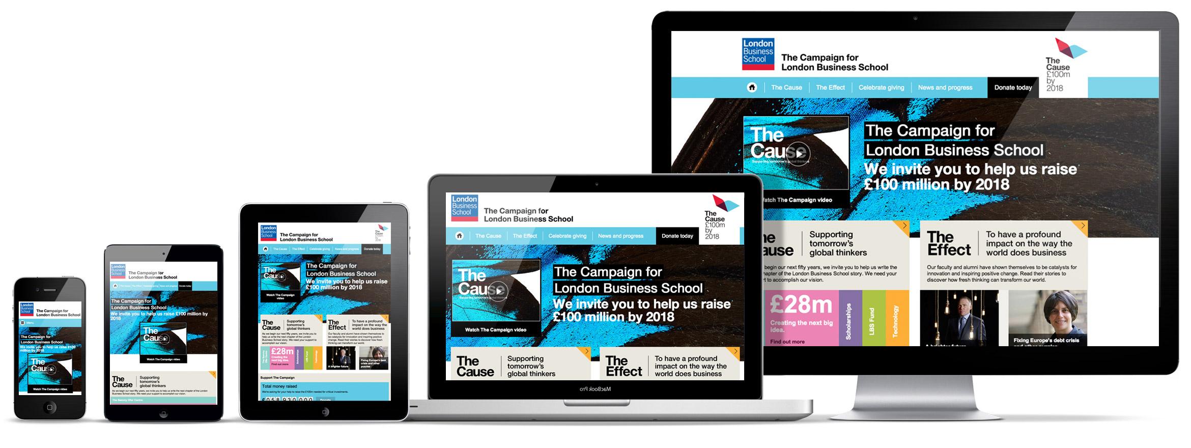
It's becoming much more difficult to keep things consistent with the rise of responsive design and the variety of devices in use (mobiles, tablets, laptops, desktops, watches).
Designers often don't have the time to create a static design of one component (let's say a header or a footer) across 10 various resolutions and viewports when working on a responsive website design project with all of its complications. Even if they only design for the most popular devices, they'll need to consider 4-5 displays with varied aspect ratios, densities, and proportions. To say the least, it's not an easy process.
A fresh approach to website design and planning
The first phase starts with a client questionnaire that asks about the project's overall business goals, target audience, conversion methods, and various performance expectations, among other things. This is done before the design phase begins in order to have a better understanding of the client's requirements and the project over all in order to be down the line and increase the efficiency.
The second stage is to create a project outline to ensure that the brief has been comprehended. This is useful while working on projects in a field where you don't have a lot of experience or knowledge. It's similar to a functional specification, although it's not as technical.
This helps in the definition of terminology, keywords, and workflows. It's a good idea to conduct various scenarios and user flows depending on the project's complexity—typically, the onboarding flow, searching and exploring a site, or a "add to cart" and checkout flow if it's an eCommerce site.
A wireframing and prototyping
The next step in the website design process is prototyping. Building brief wireframes to discuss page structure, functionality, and how the site pages will appear on different devices is a good way to start.
What is Wireframe in design? Wireframe is the digital design world, simply is a visual design schematic; which shows the typographic style, colors, graphics, and interactive elements which allow to represents a specific point in the design process. The goal of preparing the wireframe is to show page-level layout ideas that illustrate functionality, behavior, and priority of content.
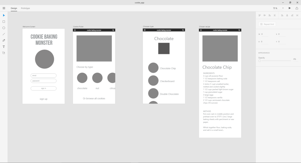
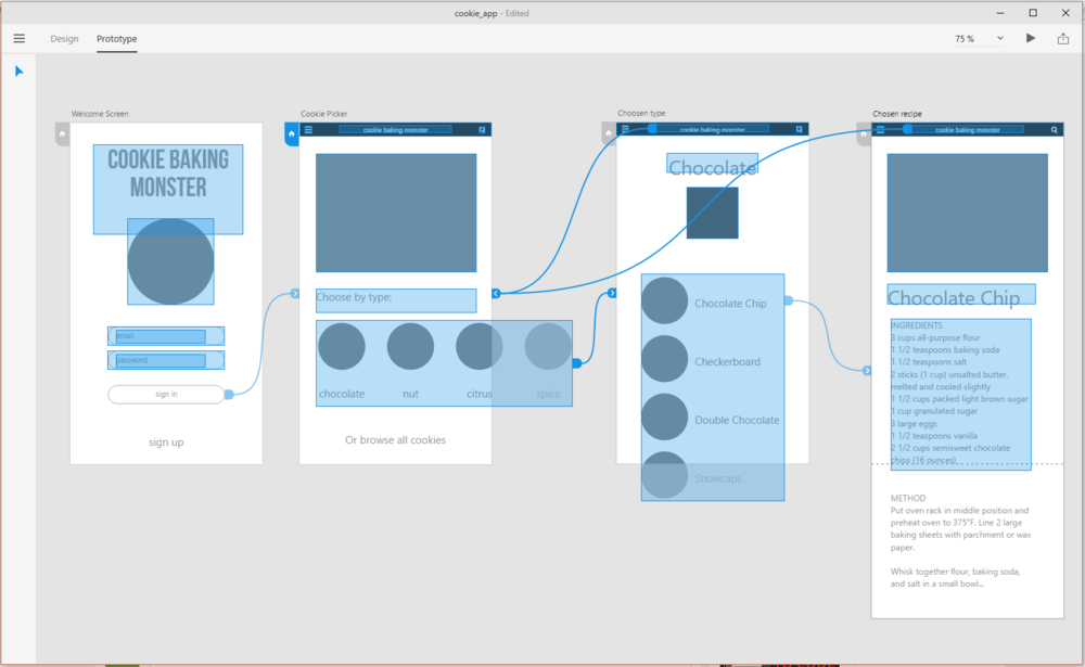
Wireframing with Adobe Xd
Creating dozens of wireframes forvarious templates and components does not take long. Prototyping software such InVision, Adobe XD, Balsamiq, Moqups, or Axure can be used to produce a simple website prototype, depending on the complexity of the project.
Mood boards and Interface Inventory
The next stage is to create a mood board, which is a collection of elements from other websites that the designer, client, and other users might like—layouts, look-and-feel, colors or fonts, icons, photographs, and so on. This will aid with the overall appearance and feel of the site. If the customer has a style guide for branding, it should be taken into account and included into the new site design.
It's a good idea to complete an interface inventory when various objects have been approved—wireframes, prototypes, mockups, mood boards, and so on.
If you're starting from scratch with responsive web design, start by listing all of the components and aspects that the project will be made up of. An unordered list will suffice and is certainly preferable than nothing. Tables, buttons, photos, typography, media, and forms are just a few examples.
Interface inventory is a comprehensive collection of the bits and pieces that make up the whole interface.
Designing in the Browser
With the growth of responsive web design, the term "responsive web design" has gained popularity. Designers were encouraged to transfer the design phase into the browser and use CSS for layout and styling to reduce the number of hours spent in design programs. This website design method is more efficient because it eliminates a number of procedures. Time spent producing static mockups of pages in other design tools such as Sketch can be saved by focusing on mockups and testing design concepts "in-browser" with CSS. Designers should invest in a robust code editor and devise a solid browser refresh method so that they can monitor changes in real time.
The Trouble with Fonts and Responsive web design
Font selection for a responsive web design project might be difficult. There are several opportunities as well as numerous risks. This is the best spot to try out the design because it will be used in the browser. Because font readability varies depending on size, weight, color, and rendering, designers can ensure that everything looks right and that the desired expectations are met by testing fonts directly in the browser.
There is excess of internet resources for choosing and testing fonts as well as experimenting with typeface combinations. Designers can develop fonts and test them on their page templates immediately while working with a certain font. It's straightforward and quick to create a Typekit package with new fonts, and you can immediately examine how different fonts affect one other.
Icons that Fit the Brand Style
If you're making bespoke icons, you'll need to decide on the size, grid, and style. Every artboard in Illustrator, for example, would represent one icon. Illustrator icons may be simply exported as SVG or PNG files, which can then be converted into an icon font using services. Vector icons (SVG) are preferred because they are resolution independent, so there are no issues about how they will appear on high-definition screens.
Keep the Website Design Process in Check
Even if we design in the browser, with dozens of templates and components, it's easy to lose track of where and how something is used. As a central repository, creating a style guide for all components is an excellent idea. This style guide will be used to create specific page templates.
Style Guide is a living document of code, which details all the various elements and coded modules of your site or application.
This style guide will be used to create specific page templates by merging UI components and elements into web pages.
Paging, product listing, picture gallery, modal windows, form elements, and other UI components are utilized as building blocks for templates. When it's time to test create a certain UI component, having everything in one location comes in useful.
If everything is broken down into smaller parts, it's easier to keep track of changes (whether using source control or not). It's critical to keep the style guide up to date once the website design project has gone live, as the team will need to keep track of every site component.
Conclusion
Then, What’s Next?
Now you have a central source of UI components, with each piece documented and web pages created from them. Designers will most likely no longer need to open their favorite design tools from this point forward, as the majority of "design" will be done directly in the code and previewed in the browser.
Not sure how a particular adjustment will affect the design? You can now test your design on many devices and browsers at the same time to see how changing the font on a heading or the size and color of a button affects the overall design.
We can evaluate the performance of a work-in-progress web page and make informed decisions based on the results.